


Brand management
 A lot of money is spent (and wasted) on corporate branding.
I discovered this when I started working in public relations 37 years ago. In those days, if a PR agency acquired a new client, it was not uncommon to suggest, as a first step, that they change their entire brand identity.
It was sold to them as a way of moving on from the past (modernising!) with the added benefit that it might generate some publicity. What we didn't say was that, for the PR company, it was a great way to hit the ground running and stamp your mark – literally – on the client.
It was a nice little earner too because in those days every expense – concept, design, materials (everything from letterheads to signage) – was marked up by 15 or 20 per cent. And that was on top of the consultancy fee.
In terms of making a bold personal statement publishers and editors do much the same thing, often commissioning a new masthead or ordering the redesign of an entire publication within weeks of their appointment.
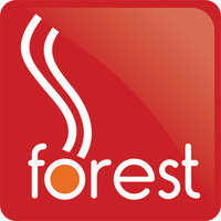
I know this because I've been there and done it, in PR and publishing. I also did it when I joined Forest. Within weeks I'd jettisoned Forest's existing logo and commissioned a brand new one (no pun intended).
The 'new' logo, designed by Patrick O'Callaghan, a graphic designer I'd worked with since the Eighties when we both worked at the Barley Mow Workspace in Chiswick, has done Forest proud for 18 years and I had no plans to change it.
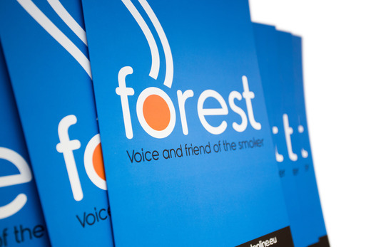
However, when we were discussing the launch of Forest EU, we agreed we needed a strong brand identity to help make an immediate impact in Brussels.
That was when I thought it might be time to replace the existing logo with a new one that could be adopted by all three Forest campaigns – UK, Ireland and EU.
So we commissioned Dan Donovan – who we've worked with since 2007 – to come up with a new design, using different colours to identify the various groups.
Twelve weeks ago we met for coffee at the Arts Picturehouse in Cambridge and talked it through. Last week, shortly before we unveiled the new branding, I asked Dan to explain the concept.
He writes:
I set about the design of a new logo for Forest after we discussed and re-established Forest's brand characteristics, values and aspirations.
The existing logo was designed way before web and social media graphics became such an important platform for brand and it was felt that now was the time for a new logo.
With the forthcoming launch of Forest EU (to add to Forest and Forest Ireland) we wanted something fresh with an international flavour serving all three organisations – a common logo with an individual twist.
We started with a clean, legible, open-faced font that suggests Forest is friendly and approachable. The use of lower case was an important dynamic in communicating this important characteristic.
Looking at the old logo we felt the dominant 'O' – which was originally meant to suggest a smoke ring – was confusing as a graphic. By removing it we wanted to have an icon that suggested 'smoking' in a manner that more people could understand.
With two simple waving lines coming from the glowing orange 'o' in the word 'Forest' an icon developed that could even stand alone. In particular I wanted an image that countered the all too common 'No Smoking' graphic with all the negativity that smokers like me find offensive.
The colour coding for the three organisations have an obvious generic feel – blue for EU, green for Ireland, and a continuation of the established UK brand using red.
However we wanted to achieve a strong, confident, approachable brand and chose bright but mature colours. Moving away from the conservative, formal tone that was used previously, the new Forest red is brighter and more direct.
The orange 'o' – that features in all three logo variations – is an important feature because it represents a burning cigarette which, if you look closely, glows orange not red.
Given that Forest's extended family of supporters now includes smokers and vapers (dual users especially) the two wavy lines might also be said to represent both smoking and vaping. (Well, that's my interpretation. No emails or letters, please!)
Design is highly subjective, of course, but I'm very happy with the new branding. After 18 years I think it was time for a change.
Photo: Dan Donovan
 Simon Clark
Reader Comments (7)
Careful. Debs will have YOU plain packed if you start talking about branding :-)
If ASH is correct about plain packaging our new colourful branding will encourage thousands, possibly millions, of non-smokers to support us. Watch this space.
You're obviously trying to entice children with the bright colours 😉
Nice logos! Hopefully the first step in expanding Forest's reach...
Like it!
That's pretty glitzy packaging, Simon. Really, you should be considering the impact it will have on 'our' cheeldren. They'll all be rushing out to buy packets of fags now, just so they can be part of the forest family.
Debs 'just-sucked-a-lemon' Arnott will not be pleased.
Very nice logo indeed.